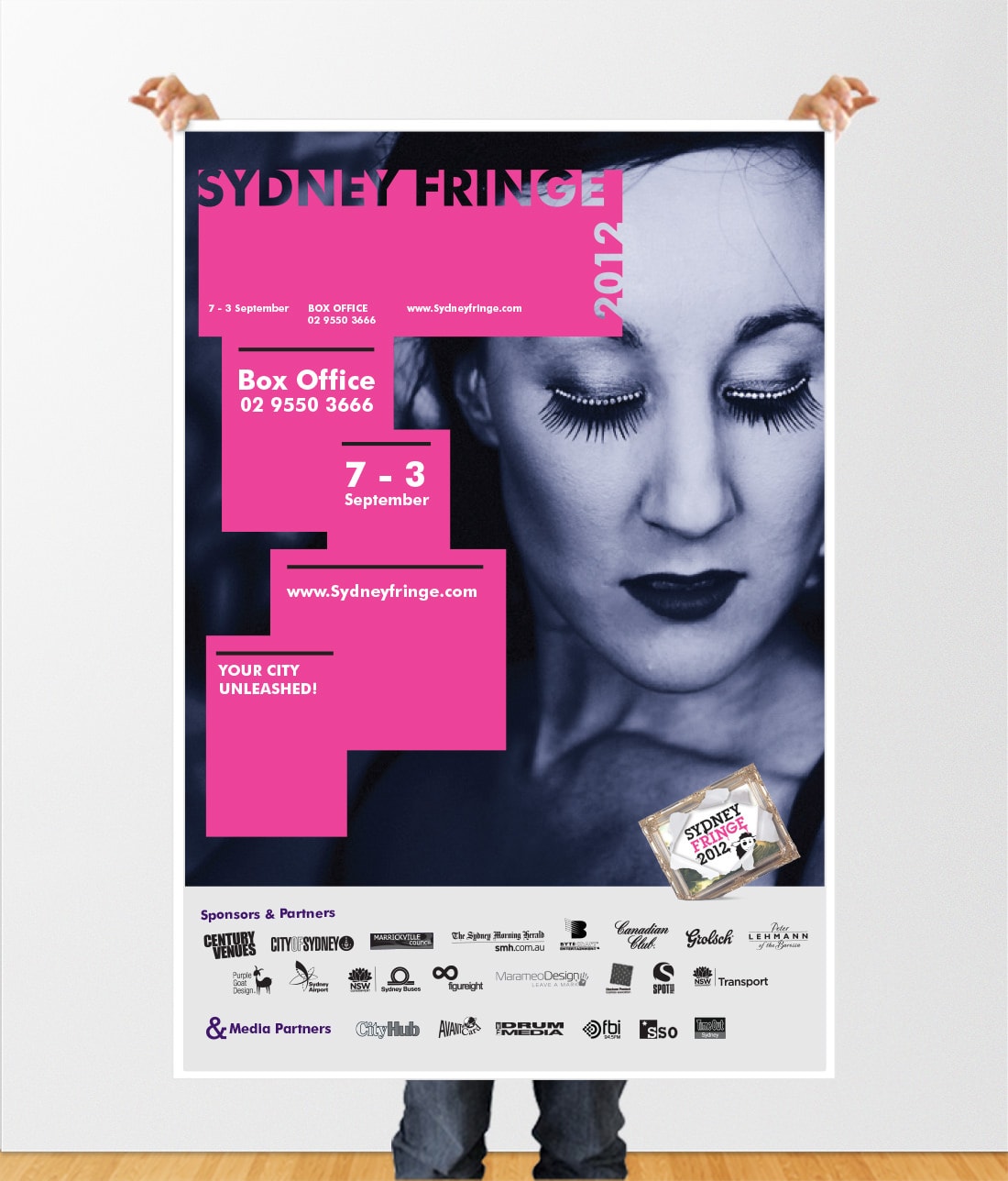
Sydney Fringe Festival
The Sydney Fringe Festival is a celebration of urban culture and the unconventional, featuring a multidiscipline showcase that spans theatre, gaming, music, and food. The 2023 festival attracted 100,000 attendees who engaged with incredible work from over 2000 artists, transforming Sydney’s diverse spaces—from Spiegeltents and terrace houses to street closures and escape rooms—into vibrant stages for fierce, brave, and experimental performances.
The Objective was to develop a modern, bold, and unique brand identity that reflects the festival’s eclectic and avant-garde nature, ensuring it resonates with a diverse audience and effectively communicates the festival’s ethos.
We addressed the challenges of capturing the multifaceted nature of the festival’s offerings, from theatre to gaming to food. Creating a look that embodies the urban, unconventional spirit of the festival and ensuring consistency across various platforms and mediums while maintaining a dynamic and vibrant aesthetic.
The new brand identity for the Sydney Fringe Festival was a resounding success. Key outcomes included:
- Modern and Bold Aesthetic: The design captured the festival’s avant-garde and urban spirit, appealing to a diverse audience.
- Enhanced Visibility: The striking visual elements and bold typography increased the festival’s visibility across various platforms and media
- Cohesive Experience: Consistent application of the brand identity across all touchpoints provided a cohesive and engaging experience for festival-goers.
Project Role
Art direction
Category
Campaign, Print

